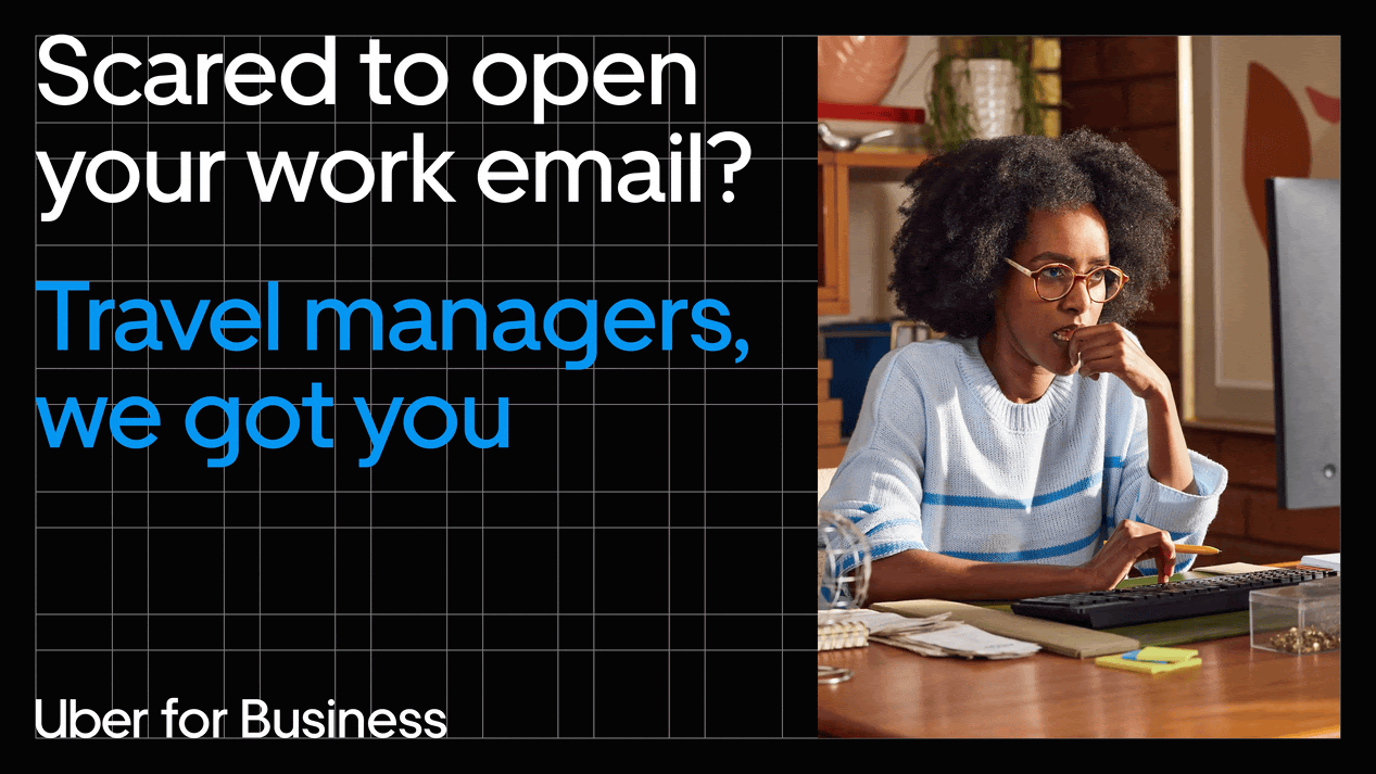
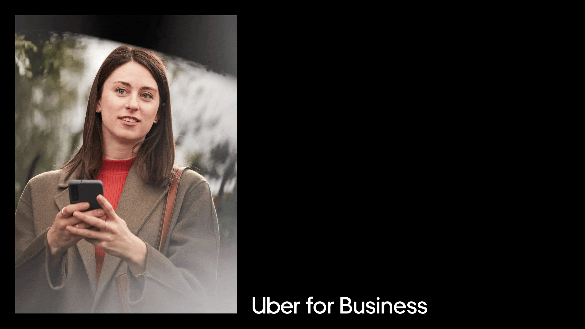
Uber for Business understands that business travel is hard, and most of the burden ends up falling on travel managers. That’s why we worked with Instrument to let travel managers know Uber for Business makes global business travel effortless.


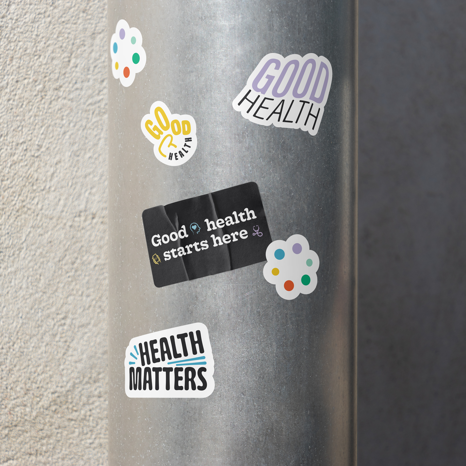
Responsible for the development of Carbon Health’s internal employee swag program. With so many teams and a constant influx of requests, my goal was to create a suite of designs and high quality products that each team could choose from and proudly represent themselves with.
Employees could choose from a variety of different template options, ranging in typefaces, brand messaging, color, and application.
Employees could choose from a variety of different template options, ranging in typefaces, brand messaging, color, and application.
Client: Carbon Health
Role: Lead Designer
Year: 2022
Role: Lead Designer
Year: 2022


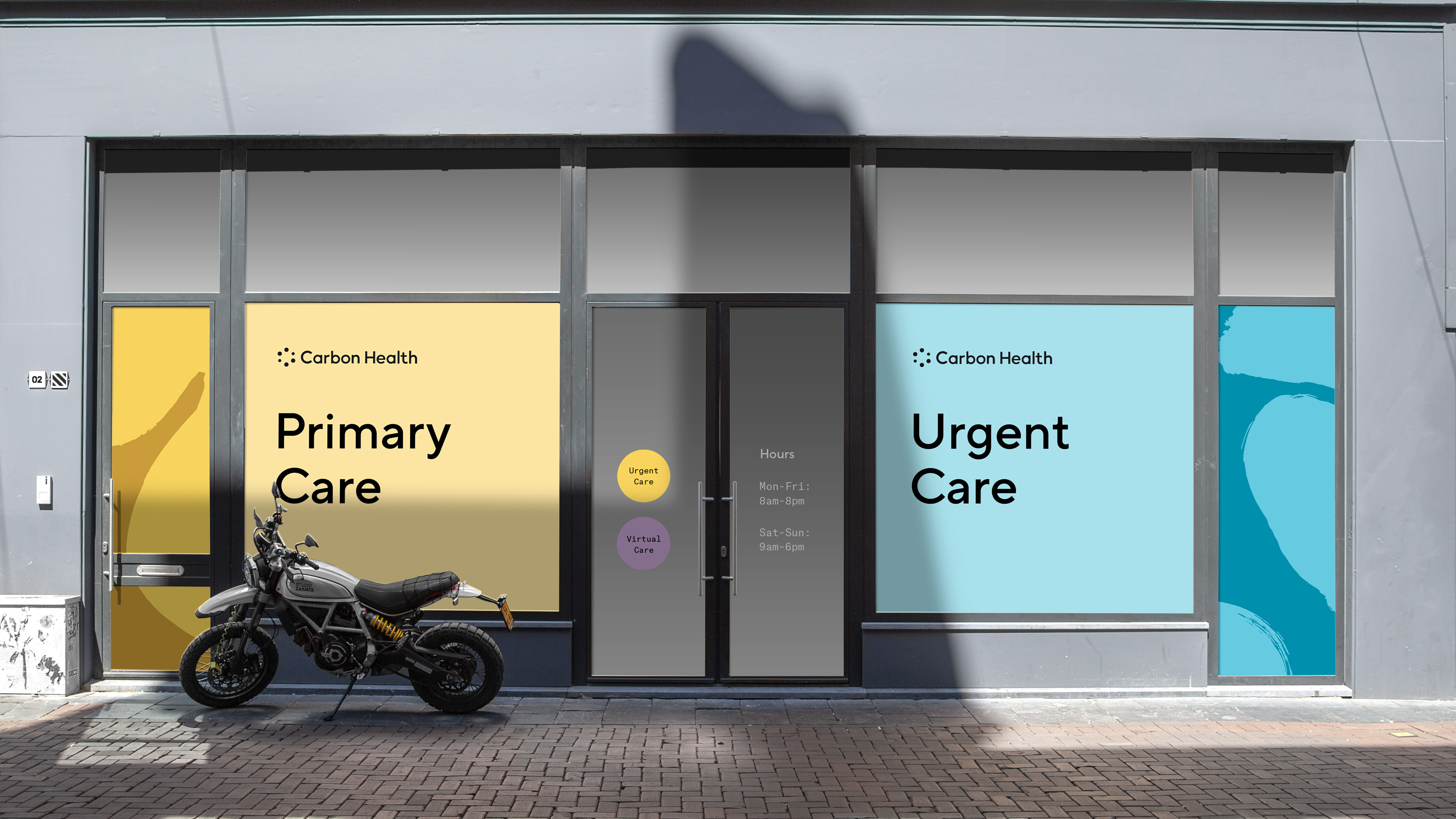
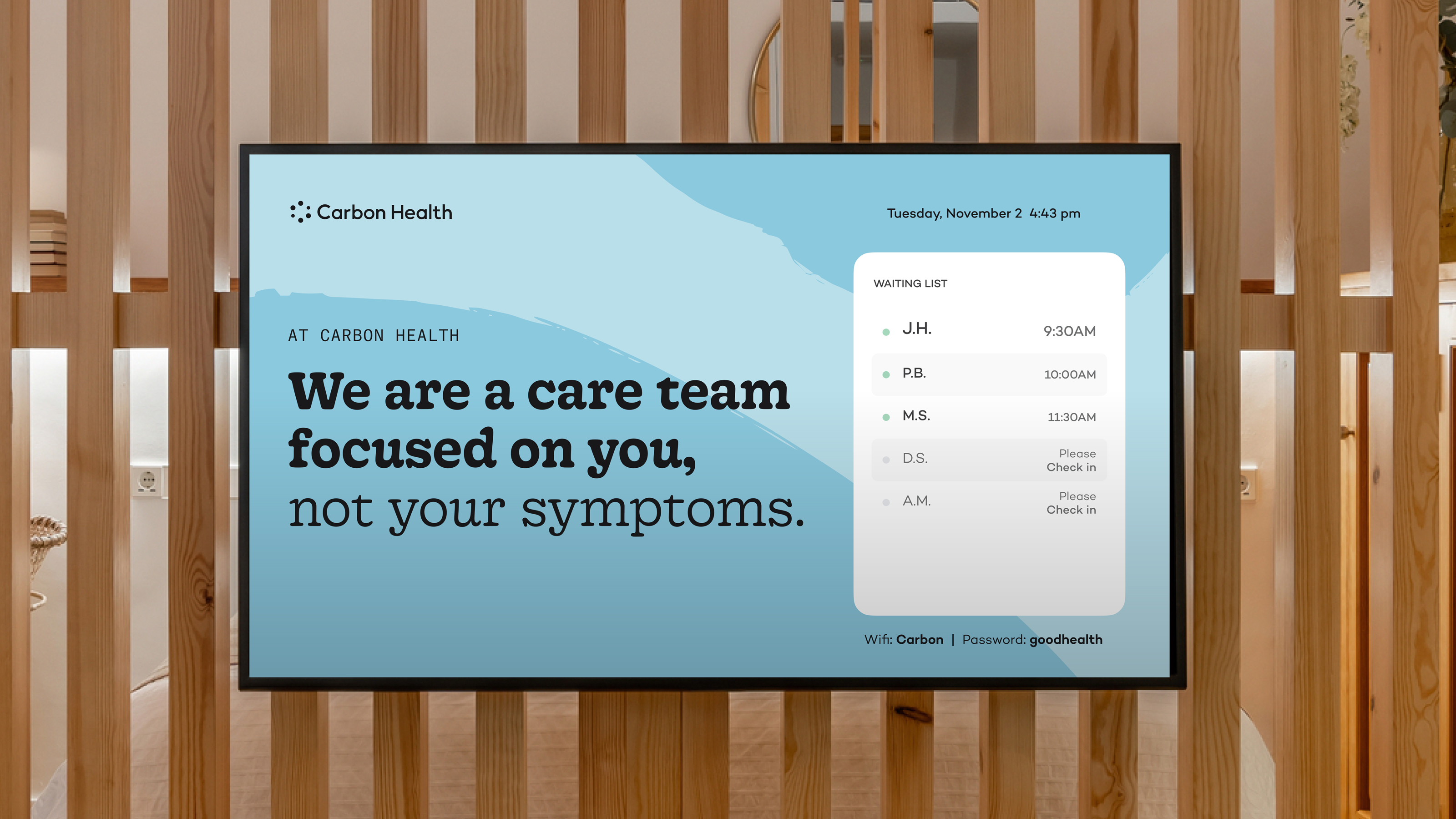
Environmental graphics and wayfinding package for Carbon Health clinic exteriors. As Carbon Health’s brick-and-morter presence rapidly grew, I was in charge of designing and directing a suite of graphics and signage on over 100 clinics nationwide.
Client: Carbon Health
Role: Design, Art Direction
Year: 2022
Role: Design, Art Direction
Year: 2022


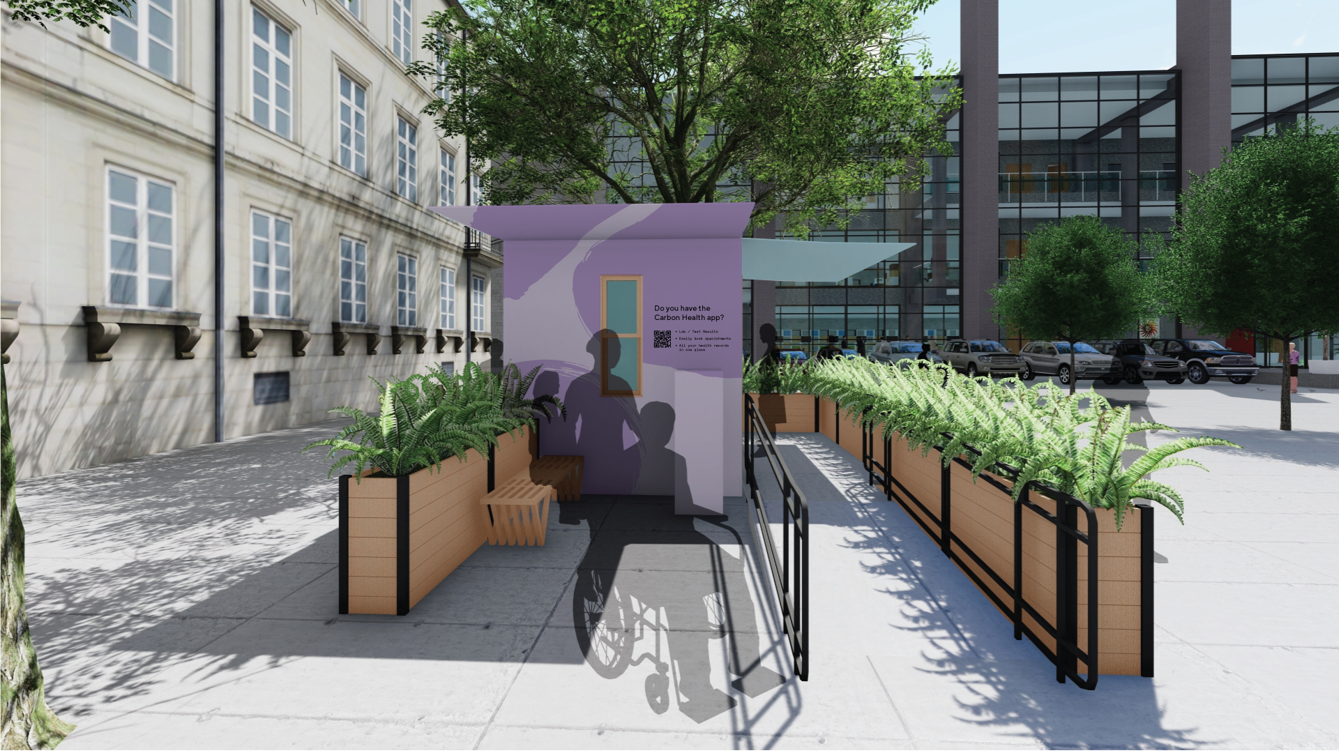
Carbon Health Carepods
A smaller version of Carbon Health’s DeNovo clinics that offer the same exceptional experience. These vessels were used for both enterprise and core services, and seek to introduce a new patient to the Carbon Health community. Dropped in parking lots, malls, and in front of businesses, these Carepods were meant to be a mobile and approachable solution for care.
My main objectives were to let the patient/public know what these vessels were and how to navigate them. The answer to these questions came in the form of a vessel that acted as a Carbon Health billboard, and a mobile wayfinding package.


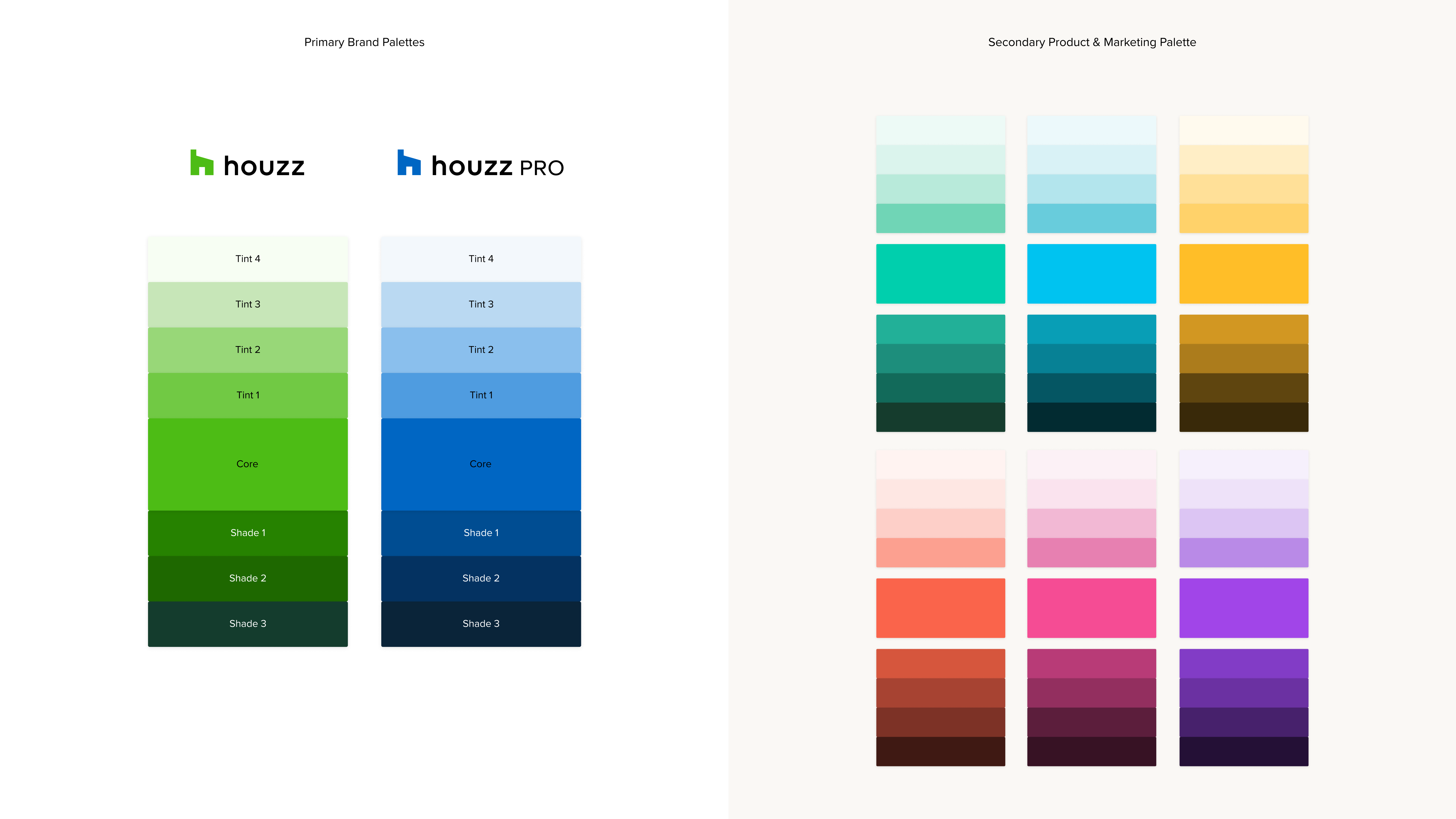
Created a cohesive, web accessible color system, to work
across both of Houzz’s brand verticals, and meet the needs of product
and graphic designers.
As a brand we wanted to ensure both audiences felt they had a dedicated and unique experience that met their needs, which led us to prioritize creating a new brand language and visual system for Houzz Pro.
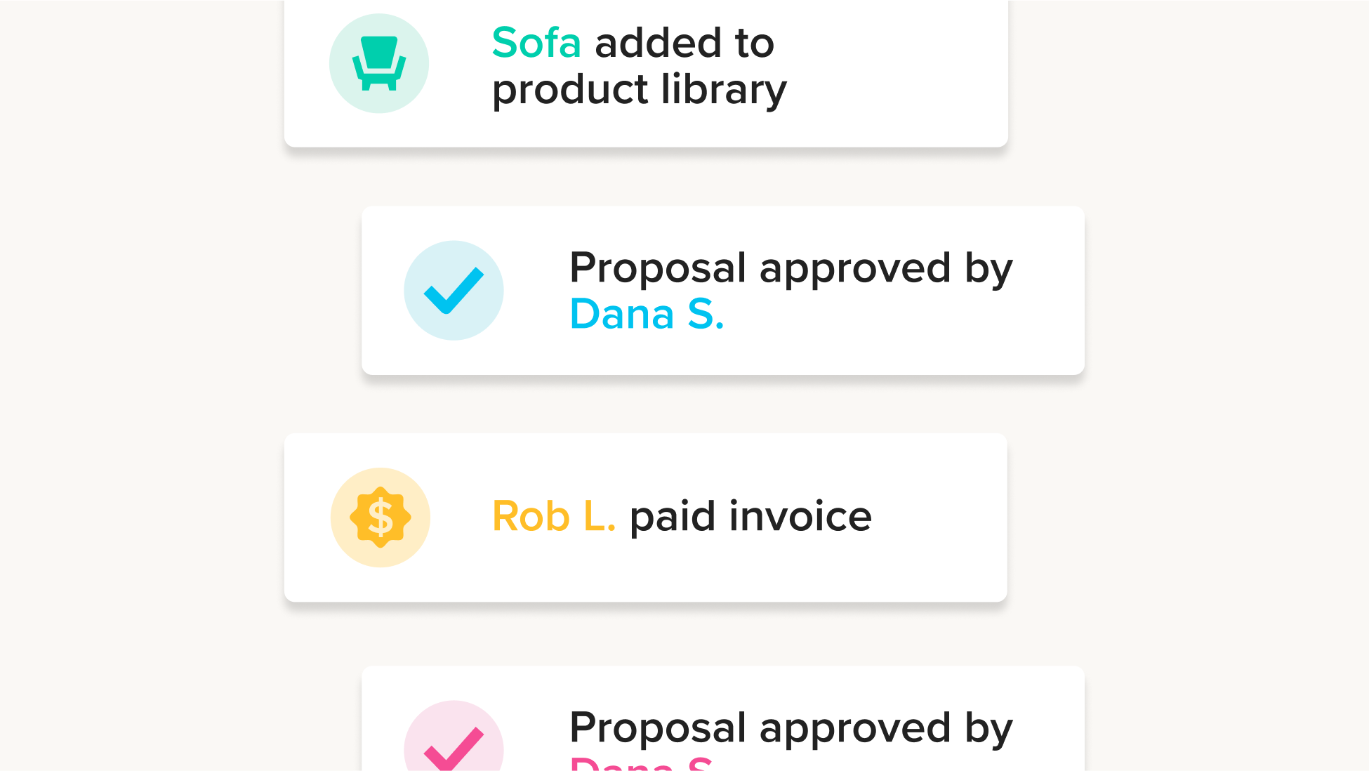
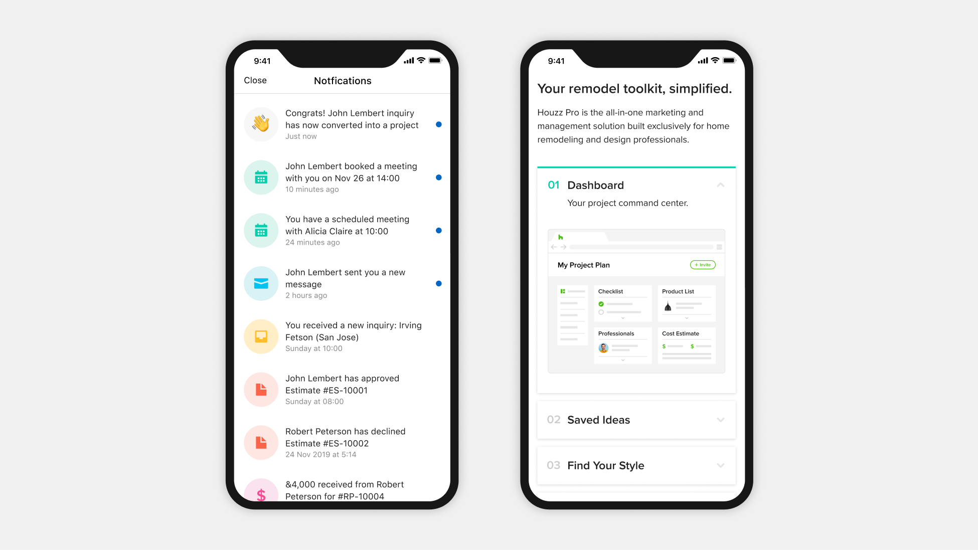
Houzz is a platform for home renovation and design. On Houzz homeowners could get ideas, shop for their homes, and even hire pros straight from the platform. As we grew we saw the need to offer a more personalized experience for home professionals. We launched Houzz Pro which is a business management tool designed to help pros grow and manage their businesses.
As a brand we wanted to ensure both audiences felt they had a dedicated and unique experience that met their needs, which led us to prioritize creating a new brand language and visual system for Houzz Pro.
Client: Houzz
Role: Lead Designer, Design Systems, Guidelines, Color
Year: 2019
Role: Lead Designer, Design Systems, Guidelines, Color
Year: 2019
Overview
I was specifically tasked with creating a cohesive color system that not only met web accessibility standards, but also worked across both brand verticals, and met the needs of product and graphic designers.
I started by streamlining the two primary brand palettes, and developed the secondary colors after. The following palettes are what was decided on after rounds of feedback and testing.
Product Application


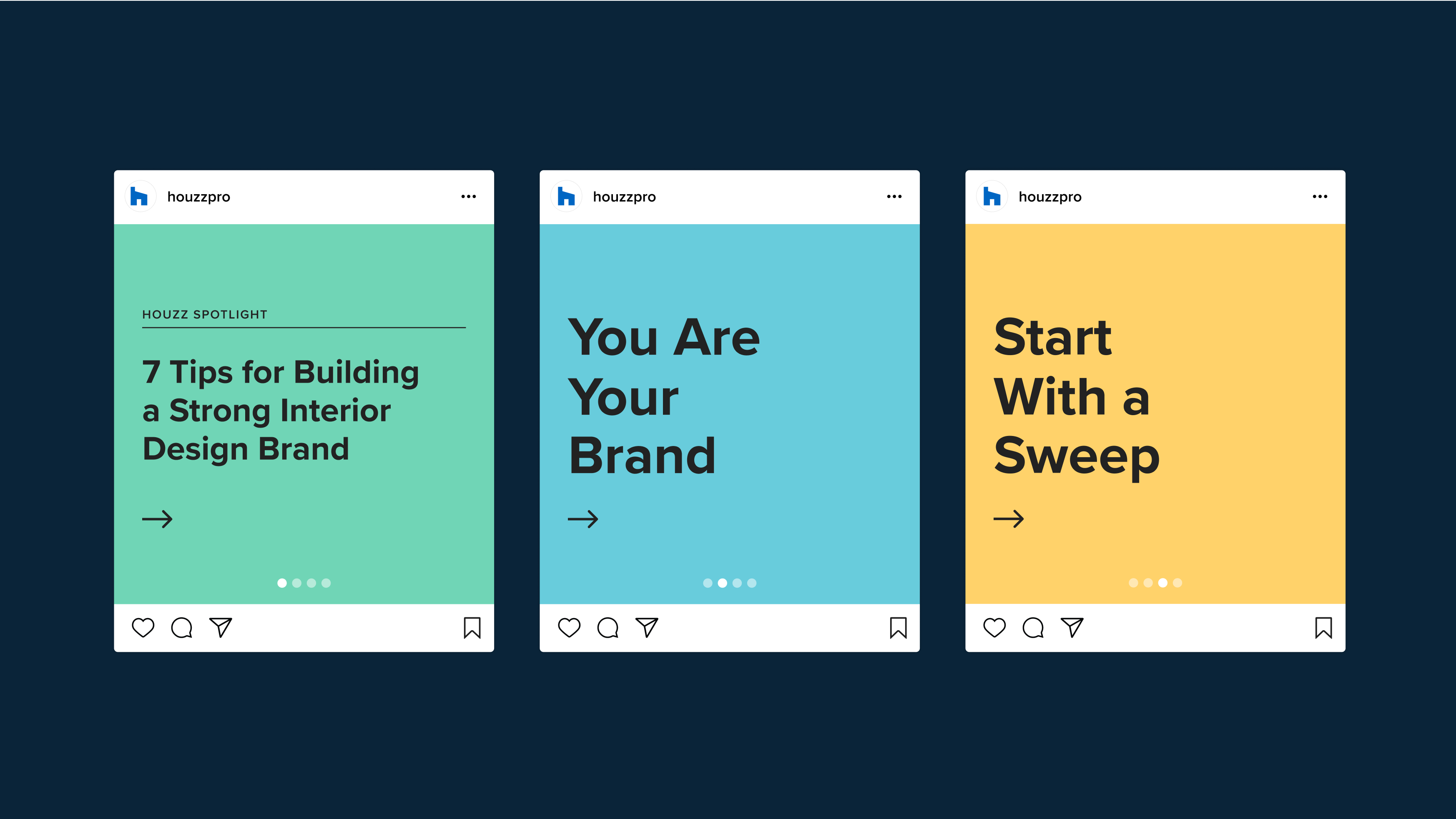
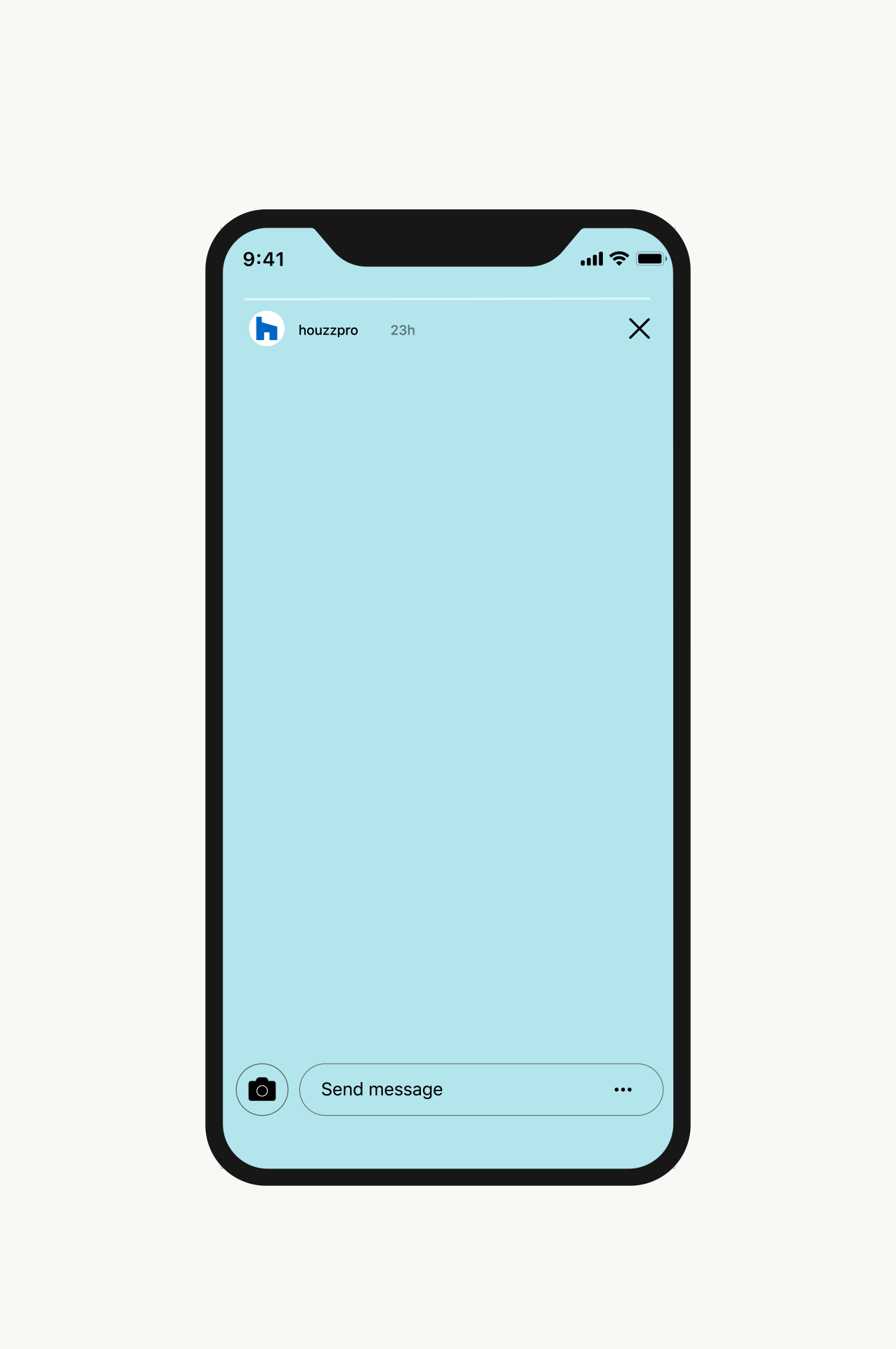
Marketing Application


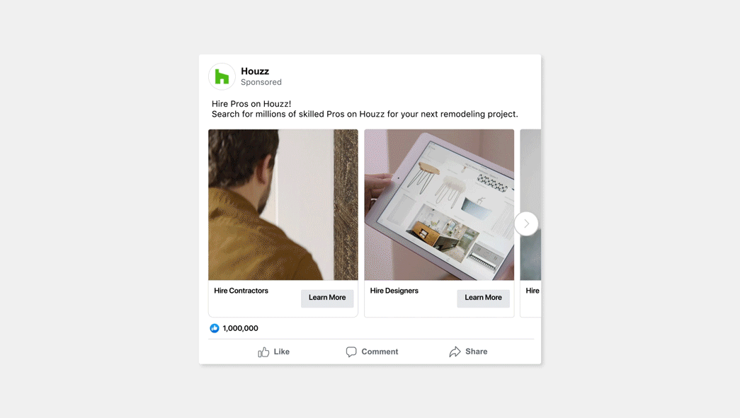
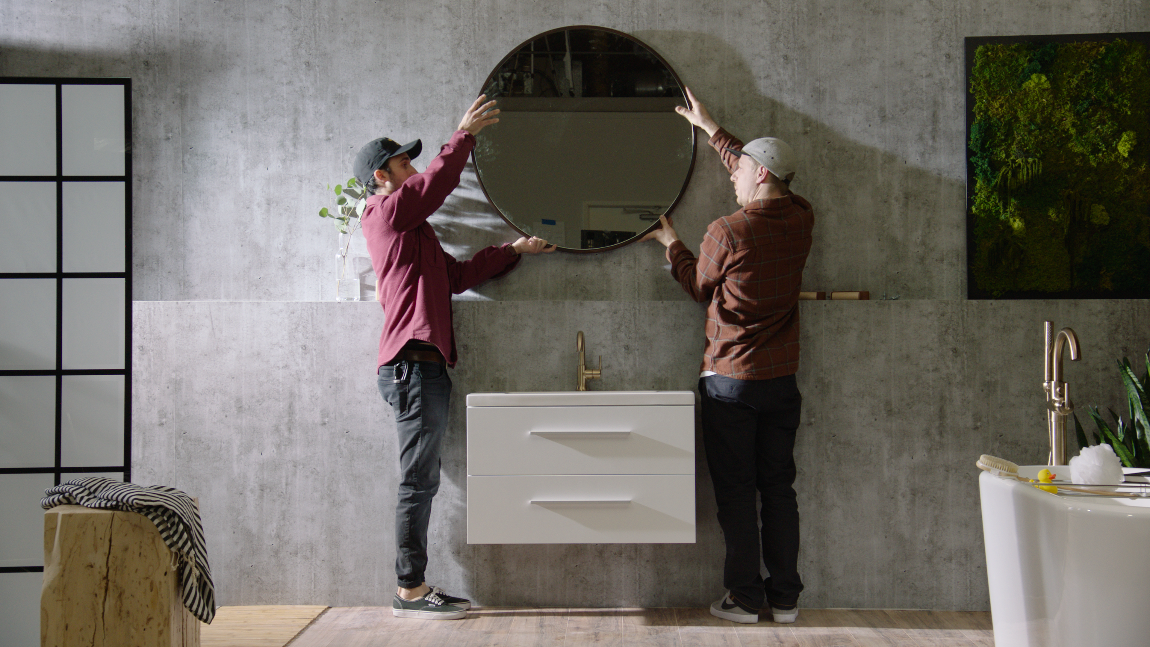
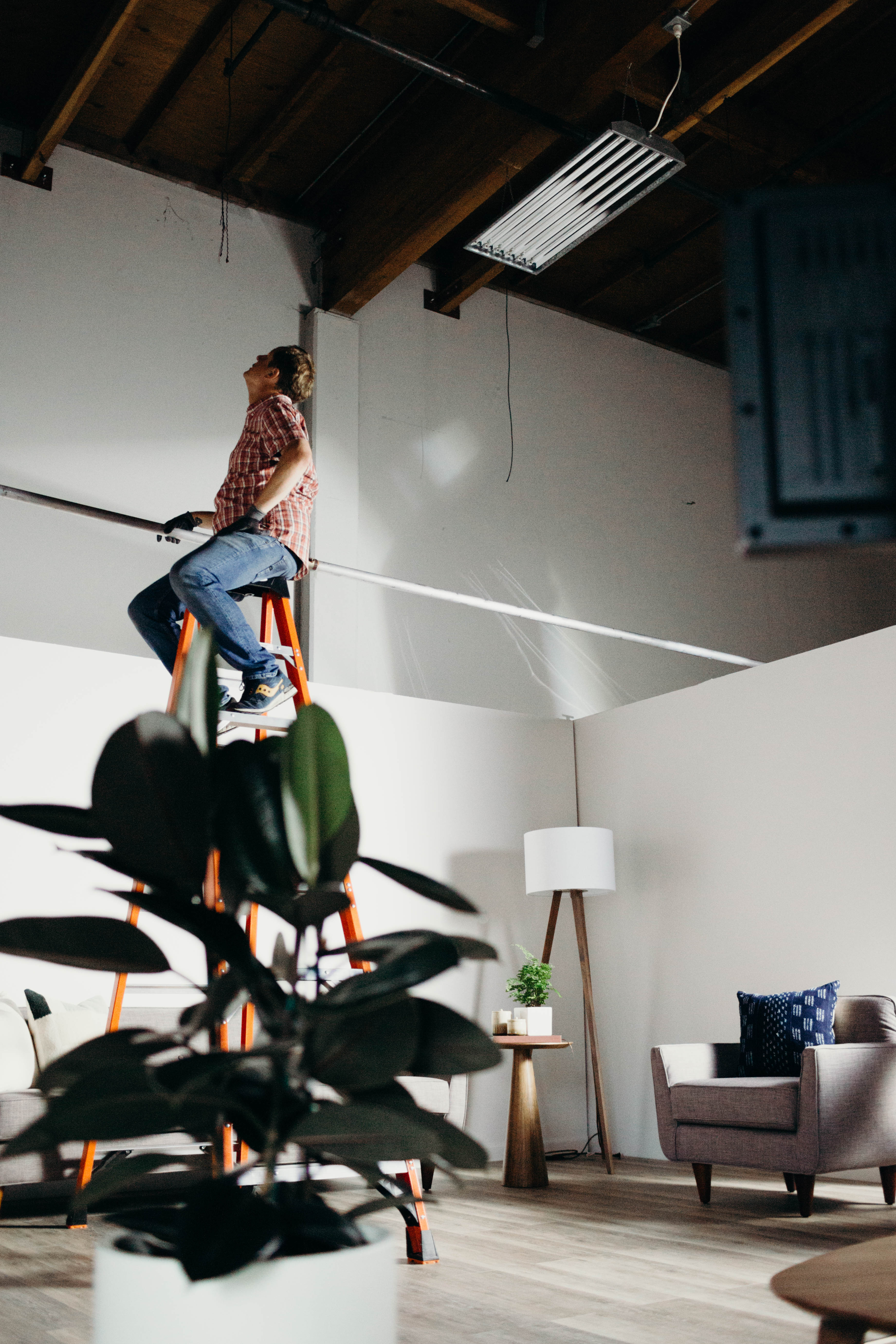
Conceptualized and created a national broadcast ad campaign in collaboration with the Houzz marketing design team. The campaigns were focused on getting users to shop and hire pros on Houzz.
Collectively, this set of direct response ads has over 2.5 million views on Youtube, aired on top networks like HGTV, FoxSports, ESPN, A&E, TBS, Hallmark, and TLC, and caused over 200,000 unique visitor spike to the site after airing during the world series.
The team and I saw the creation of these ads through from start to finish, working with little budget, no studio space, and a very tight timeline. Deliverables were 30 second, 15 second, and 6 second cuts of the ads, as well as alt versions for placement on social.
Role: Art Direction, Motion Design
Year: 2017
Year: 2017
30 Second / Hire Pros
30 Second / Shop Bath
Facebook Carousel Cards